12 Feb 2023
Step-by-step painting 01
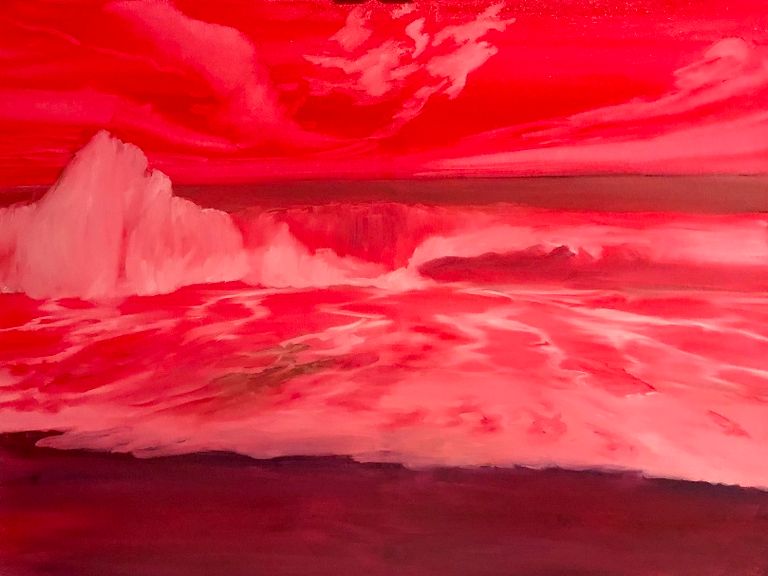
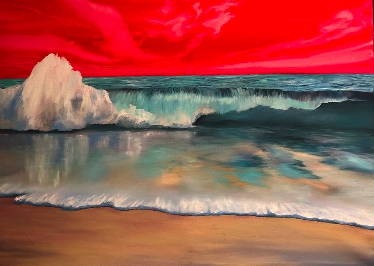
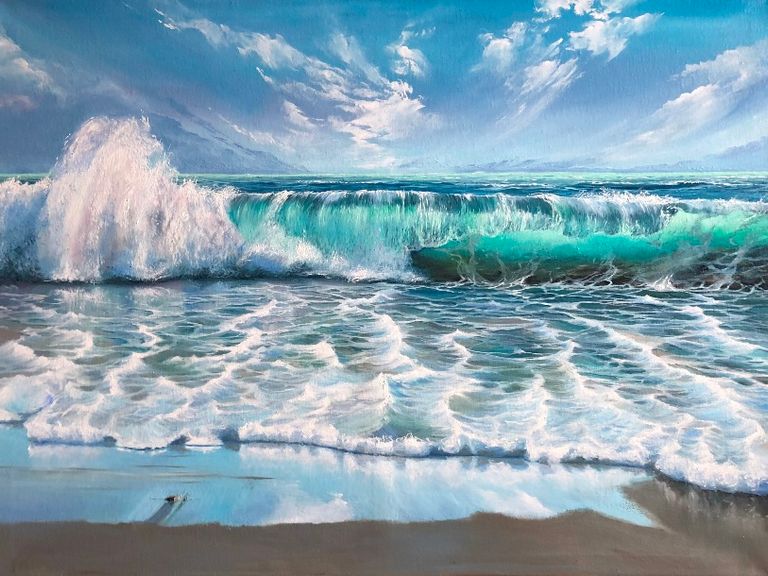
This is a step-by-step description for a seascape of 80x60 cm, oil on canvas.
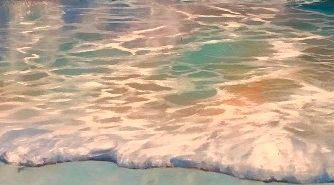
This studio work is based on 4 different reference photos. It is made in six painting coats, in six workdays.
Day 1
I start this painting by making a deep and consistent imprimatura – an underpainting layer in contrasting colours, which will give brightness and depth to all other applied layers.
Imprimatura lets me accomplish many goals at the same time; there are 2 most important of them: 1) It will give radiance to each of my final colours, which are physically going to stand out on the underpainting contrasted layer; and 2) It creates my entire composition on the canvas rapidly at once, allowing me to concentrate on painting one part after another, without being pressed to finish all the surface.
[For more details on the painting layers see the article “Oil Painting Techniques”]
In order to meet the first goal, I choose the colours of my underpainting with a lot of attention.
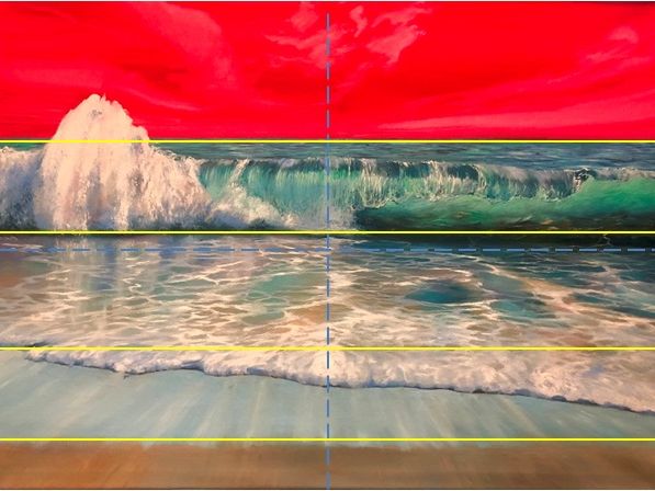
As my future colours are going to be mostly cool: blues et blue-greens, I use Cadmium Red to paint the first layer of my seascape. I know that there is one part of the canvas, which is going to be painted in warm beige-brown (sand of the beach), and I use a mix of Cadmium Red and Ultramarine Blue, to make imprimatura cooler in this area of painting. I add some Zinc White to highlight clear areas. I do not use any other medium or liquefier; but I make the layer thin, blended, to ensure that light will circulate through this first underpainting layer.
And for the second goal, my imprimatura sets a good base for my composition.
I want the water to take almost half of my painting:
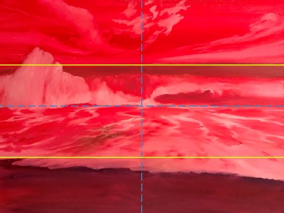
I make my composition to be a set of four large objects: a sky; a cylindric rolling wave; some water on the sand of the beach; sand of the beach.
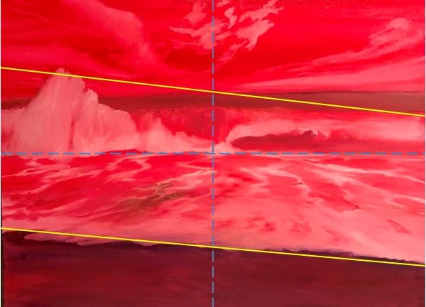
I want my future artwork to be graphically attractive, decorative, and I add some symmetrical asymmetry :) in the composition:
And, finally, I want it to be moving, dynamic, fresh, and strong.
And I add a clearly distinctive perspective: water moves from one central point on the canvas; and so do the clouds. This exaggerated perspective point helps me to create a good 3D expanding effect of my composition, with a visible illusion of the energy of water and air masses, which move synchronically towards a viewer:
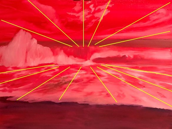
[For more details on the composition and dynamics see the article “Composition”]
All of the details of my underpainting (especially the traces of movement), I create almost instinctively, following my personal mood and feeling of the moment; these do not exist in my reference photos.
It is studio work; I am a thousand kilometres far from the sea; but I look at my future painting in red, and I feel the salty wind blowing straight in my face. And I am already happy.
Day 2
As I did not use any fast-drying additives to my paints, It took a week (6 days) for my underpainting layer to be dry enough.
I start my second layer by sculpting the sea lines next to the horizon.
I do not think a lot about the aerial perspective at this stage, I just fill in the horizon line with almost all the colours I will use in my painting (Cerulean Blue; Blue Rex, Prussian Blue, and Turquoise Blue, all of them a bit toned with browns and beiges and a bit tinted white), brush stroke next to brush stroke, to create an optical mixture of my principal colours, and an illusion of moving water.
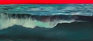
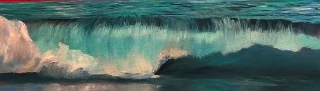
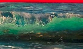
Now I create my wave in Prussian Blue toned Raw Amber + Turquoise Blue tinted white.
The wave has a distinctive cylindric form; and I pay attention to make it tube-like and glossy :)
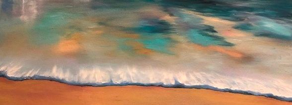
And then I paint sand (some beiges and browns) and the water on the sand.
The water has to be partially transparent; I create it with the colours I used to model my wave + the colours of the sand.
I paint some foam at the edge of the water, adding Titanium White; and I sculpt its shadow with warmish blue-brown colour (Blue Rex toned with Burnt Amber).
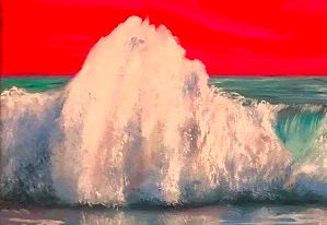
And finally, I model the foam of the wave.
It must have some weight and volume, so I work it out as if it was an apple on the table: it has white enlighted zones; cool blueish shadows, and brownish reflected light of the sea sand underneath.
I do not forget the reflection of the foam on the surface of the water! It is a fun thing to paint.
That day was the most important part of my painting process; I made the second layer of paints to sculpt the water, and it took me 10 hours of work to be completed.
Day 3
Several hours later, the second layer is touch-dry; I can start the third one.
Today I add some important details to my painting :
- I make the wave transparent inside its “cylinder” with brushstrokes of tinted Turquoise Blue and tinted Veronese Green;
- I highlight the foam of the wave and I paint some foam on the surface of the water with Titanium White liquefied with linseed oil;
- And, for the sake of better composition, I add a zone of the wet sand in tinted Cerulean Blue.
This layer took about three hours of work to be completed.
Day 4
The third layer is touch-dry after several hours on the easel, and I continue sculpting my water.
I add details everywhere:
- Aerial perspective of the horizon;
- Foam of water in the shadow inside the cylinder of my wave;
- Large sculpted foam of the water on the sand;
- Wet sand full of reflexes and small sandy imperfections;
- Dry sand has become wetter (Blue Rex tones). I continue giving some dynamics to my artwork, repeating the direction of water movement on the sand as well.
Day 5
I made a decision to make the foam on the first plan a bit smaller, a bit flatter than it was after the fourth layer.
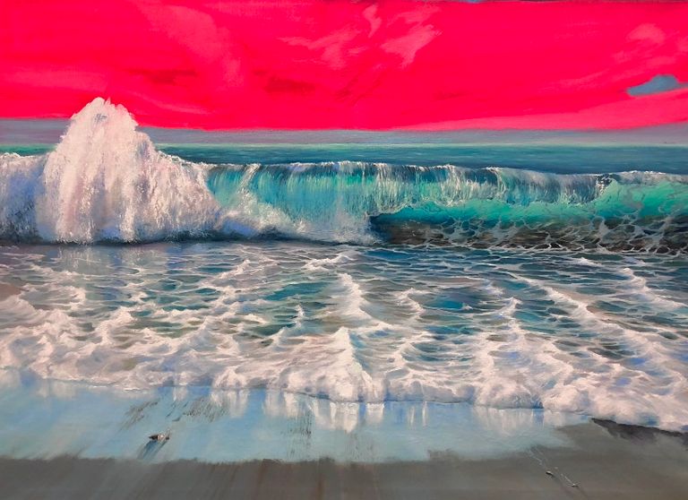
And I finally add the sky!
The colour of the sky finishes to be warmer than I expected, with a lot of Blue Rex, some Ultramarine and even some purple, and I love it!
So I change the tone of my sand to a warmer one (more Amber), as well as my wet sand (more Blue Rex), and every of my shadow (Blue Rex).
The painting becomes much warmer in several areas; there is a good colour harmony; and I start feeling that it is almost done.
Day 6
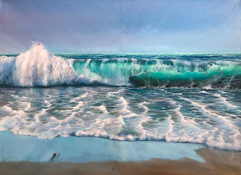
Clouds!
Clouds are everywhere – they expand quickly in the sky and they approach a viewer in the reflexes on the wet sand!..
I add some more highlights in Titanium White; some more tinted Veronese Green in the horizon – and it is finished!
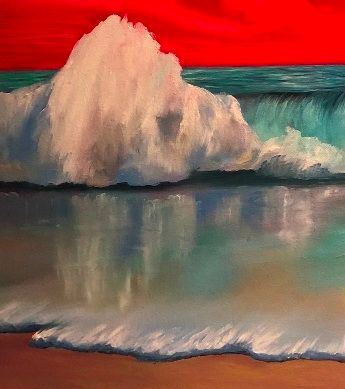
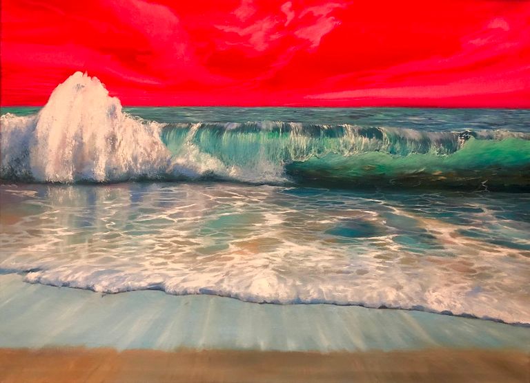
My final result is active, vibrant and full of energy.
From a strict point of view, it is not a realistic painting; not photo-realistic, for sure. It has some exaggerated 3D perspective and strong repetitive dynamics. The colours are a bit too bright to make it an everyday sea scene. But I love the effects it condenses and the emotions it causes. It is very personal, expressive, and high-powered.
Try every step of this tutorial – and you will make your personal wave. A better one – possibly, a different one – for sure! Then send me a photo of your artwork, and I will share it here with a reference to your art page!
© Bogacheff Marina. France, Switzerland. 2023
Marina Bogacheff, 80x60 cm, Oil on canvas